For the last year I’ve run Playmedesign alI by my self and it was now time to make a change. I’ve there for started a collaboration with the Norwegian fashion site Carousel where I will continue with Playmedesign in the same manner as always. Check out Playmedesign at Carousle with a brand new look, and stayed tuned for more cool stuff from Playmedesign.
Read more!
Packaging with unknown content...
Sometimes a product gets hyped up by people around it, or in this case the internet. This simple packaging from Japanese designer Taku Satoh has been on a lot of different design-blogs lately, yet know one knows what it really contains. Some seems to think it contains strawberry milk since when spoken in Japanese, 1-5-3-6-9 sounds like ichigo miruku, which means strawberry milk. Whatever it contains Sakuma Confectionary Co, the brand behind it, has manage to make so much fuzz about keeping the content secret that they have manage to create a packaging already known allover the globe.
via lost at the minor
Read more!
via lost at the minor
Read more!
Cate and Nelson
Cate and Nelson is a Swedish/Spanish design duo based in Sweden. Their furniture-design is innovative, surprising and bold, yet with their main focus at the functionality of the product. I adore the detail in their work, like how this table lamp has an integrated slot to hold your books or magazines. Or how this sideboard is covered with felt so that it will also be soft sit on (an since I am a clumsy person maybe less hurtful to crash into?) Check out more of their products by pressing more or make sure to visit them at Designers block London 2009 which takes place at Earls Court 1 in September alongside 100% Design.
Read more!
Read more!
Wallstickers from Hu2 Design
As I have said before; I live in he tiniest apartment ever, and to hang pictures on the wall would just make the space seem heavy and even smaller. That’s why I found the perfect solution; wallstickers. I got a small one from a friend of mine the other day and it really just blends into the wall and give a decorative yet fresh and light feeling to the room. Here are some wallstickers from Hu2 Design, I wonder witch one I want to have on my walls….
Read more!
Read more!
LED staircase handrail
A staircase handrails is normally used to lead and support people, but when I saw this LED staircase handrail designed by Zoran Sunjic from Croatia, I must admit my thoughts were something like ”ahh, why haven’t anyone thought of that before?”. Not only would this design light up dark spaces but it would also function as a guiding light, witch symbolise comfort and security in the dark. I can easily imagine how this could be really great in a metro or subway stations where you can get a bit confused by all the directions and stairways under ground. With different coloured light you would easily orientate and follow the light to find your way.
Via Toxel.com
Read more!
Via Toxel.com
Read more!
Roll-Out Veg Mat
Today I woke up to see that there was no longer any hope for the purple little plant I my window. I just have to admit it; I do not have green fingers. Chris Chapman has been kind enough to make a great solution to people like me with his Roll-Out Veg Mat. The corrugated cardboard mat is sowed with four types of vegetable seeds and organic fertilizer all ready to be rolled out, and all you need to do is add water and soil! The mat comes rolled up as a practical and cool packaging with good looking and fun graphic instructions on how to make your garden grow. Even I can do that!
via Inhabitat
Read more!
via Inhabitat
Read more!
Mixtape
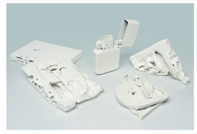
I love digitalization, don’t get me wrong, but I still must admit that I have some sort of sentimental connection with the old cassette and vinyl’s. Nothing was as precious to me as my “Maj Britt Andersen” tape when I was about five. Dominic Prévost at studio output has made some really nice campagne prints for ministry of sound London, and I love the way he used the old mixtape as symbol. Each cassette has undergone an intervention to symbolize the contrast to the iPod lists and digital music that we have today.
Read more!
Read more!
A pack of love
During Salone del mobile this spring I grabbed a small box with a nice design, and it was first when I got home to take a closer look I realised it was a small box of condoms or a pack of love as its called. The packaging it self don’t immediately strike you as a condom pack, cause it doesn’t have the cheesy fruit flavour-design or the strong and ”screaming” colours that others condom packs normally do. A pack of love on the other hand is subtle and elegant; it looks like a fancy mach-box and opens the same way. It contains 3 condoms and it’s already to bee found at Berns hotels in Sweden!
Read more!
Read more!
Help i need help
Unfortunately I have not been blessed with a superman body that never gets ill, quite the opposite in fact. There are no packaging’s as boring as the ones I gets my medicine in, and I would love to spice it up with these elegant and funny pill-boxes from helpineedhelp. I really think they are a great inspiration to the rest of the medical industry in how they have managed to give their products a funny, yet communicative and well-functional design, and the cream of the crop is that the boxes are made of corn resin and paper pulps so that they are compostable. Oh, and if you are board they can actually help you with that as well on their page!
To demonstrate the biodegration of their packaging you could follow the online experience on a daily basis. Sadly, at fourteen days and twenty-two minutes they were forced
to postpone the experiment in biodegrading due to an officefly infestation. It will return shortly.
If you are board I strongly recommend a visit to helpineedhelp.com, where they have some pretty funny flash-illustrations to help solve your problems.
via Packaging uquam
Read more!
To demonstrate the biodegration of their packaging you could follow the online experience on a daily basis. Sadly, at fourteen days and twenty-two minutes they were forced
to postpone the experiment in biodegrading due to an officefly infestation. It will return shortly.
If you are board I strongly recommend a visit to helpineedhelp.com, where they have some pretty funny flash-illustrations to help solve your problems.
via Packaging uquam
Read more!
Ribbon
I have recently moved into the smallest, but also most cozy apartment ever, and I´m therefore a bit tuned into practical yet good looking solutions to interior and decorating. I must say I like this wall-mounted coat rack called Ribbon. Its inspired by a ribbon blowing in the wind, it bridges the gap between function and art - it is a practical, everyday storage solution when in use, and sculptural wall art when free from coats!
Read more!
Read more!